Herbert Kilpin.
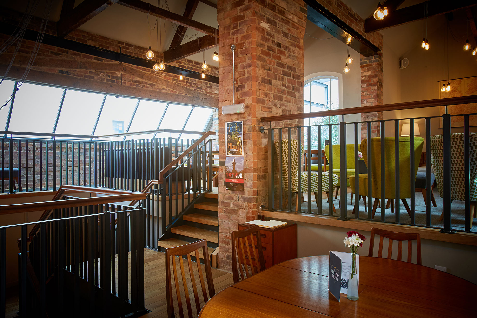
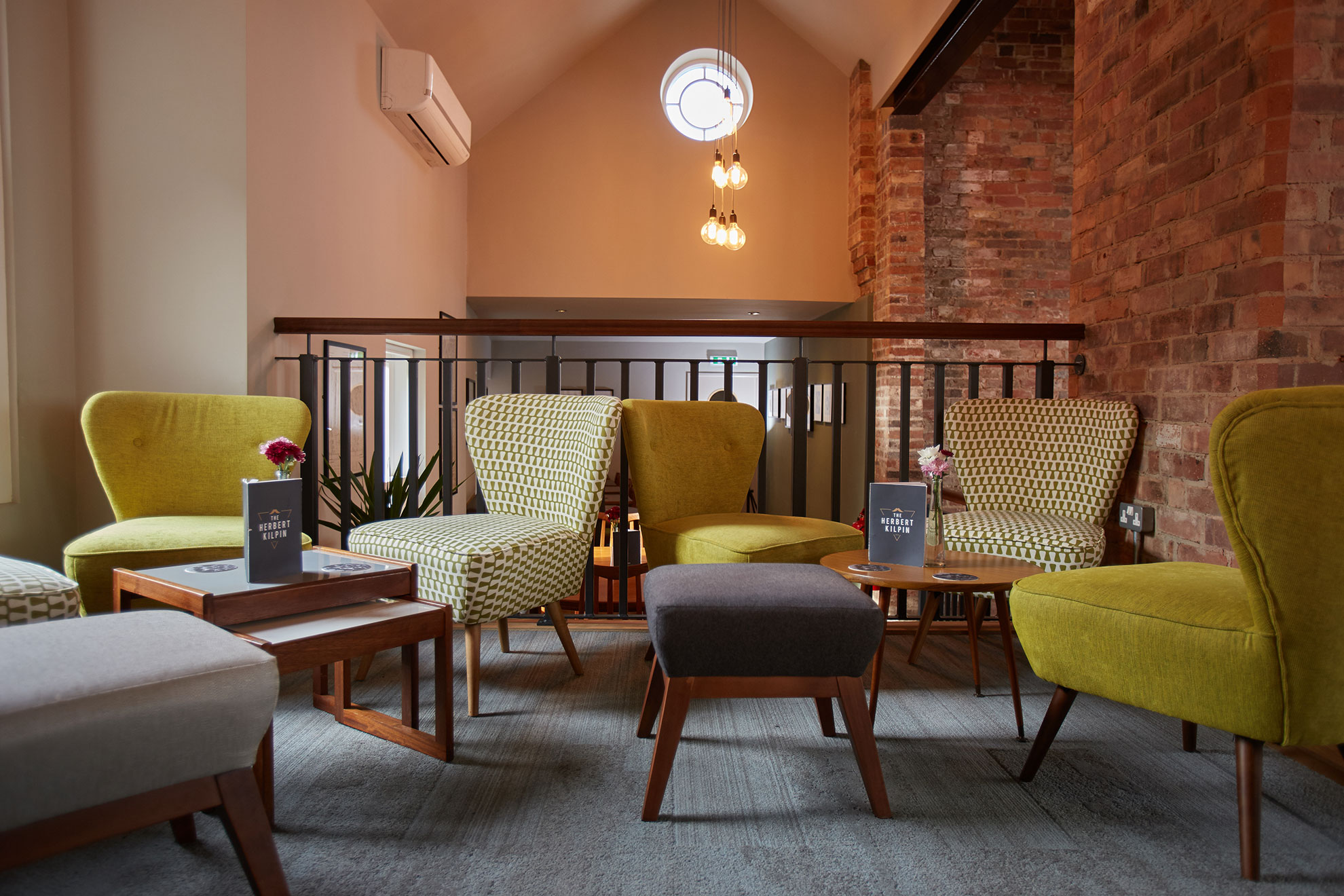
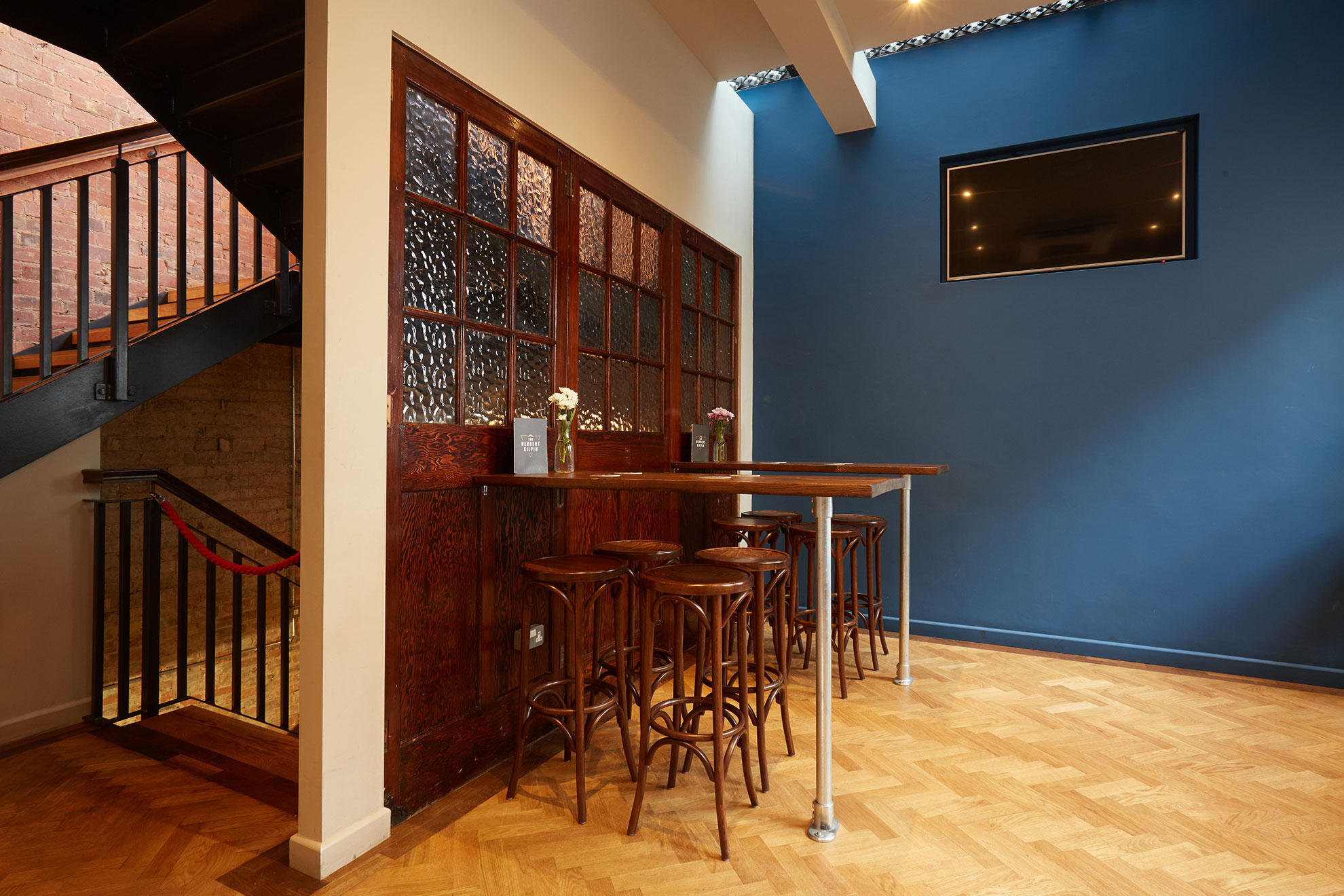
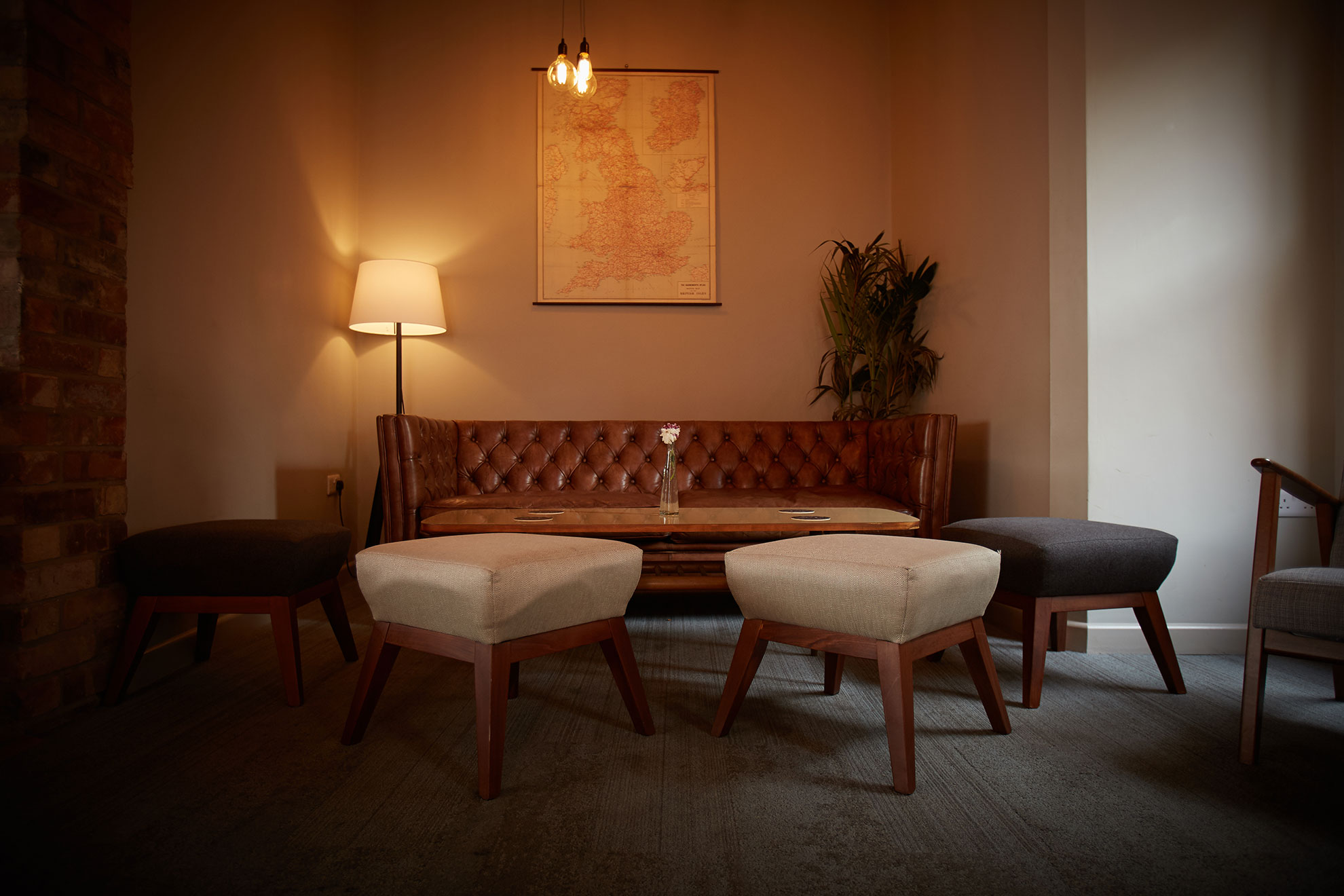
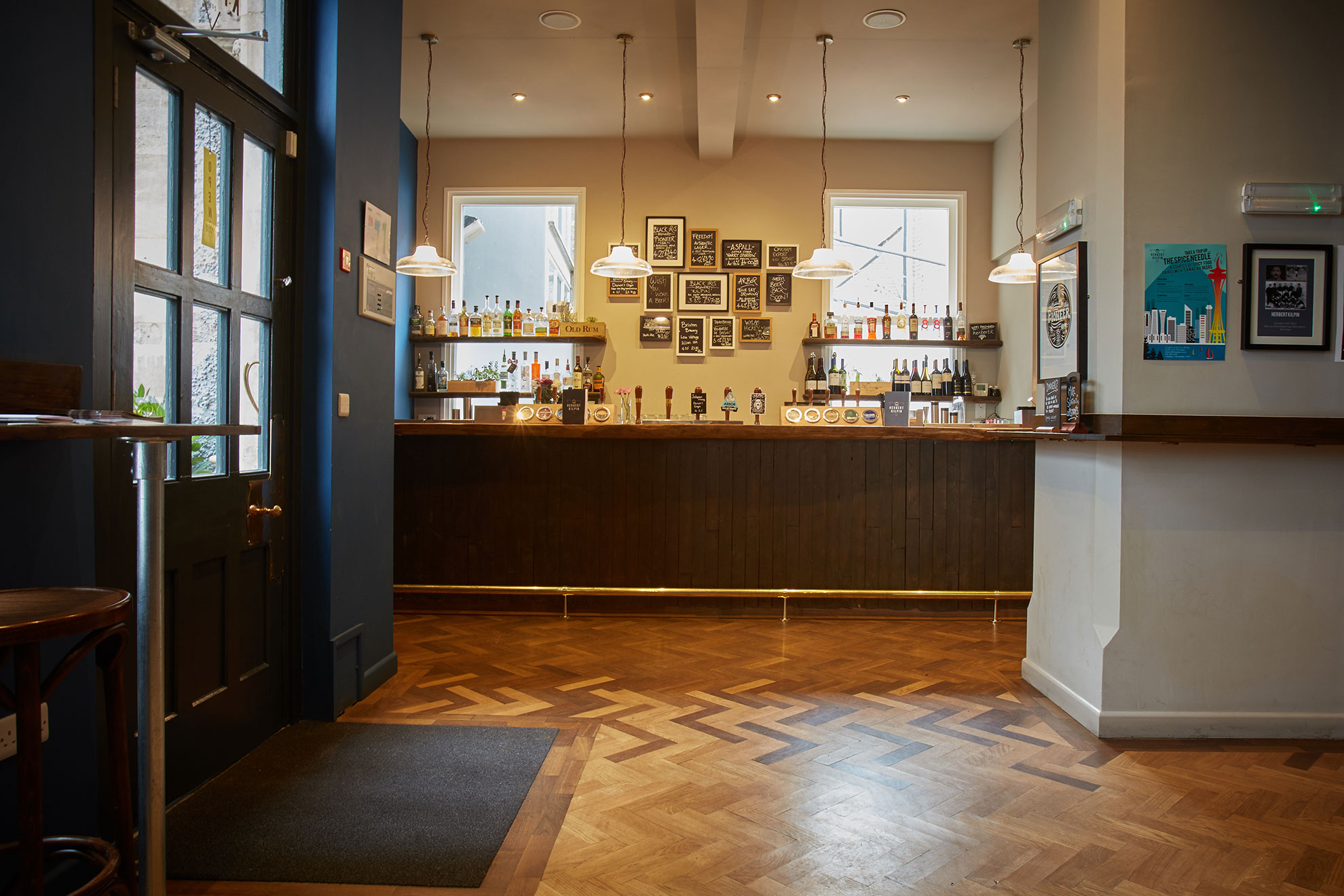
This project needed a scheme that worked within such a beautiful and iconic old building but didn’t follow any of the usual trends or styles (just like our clients). We created a twist between the heritage of the building and a cosy, inviting pub. Focus was placed on high quality products throughout, to reflect the brand’s ethos of offering the finest beers, food and customer experience.
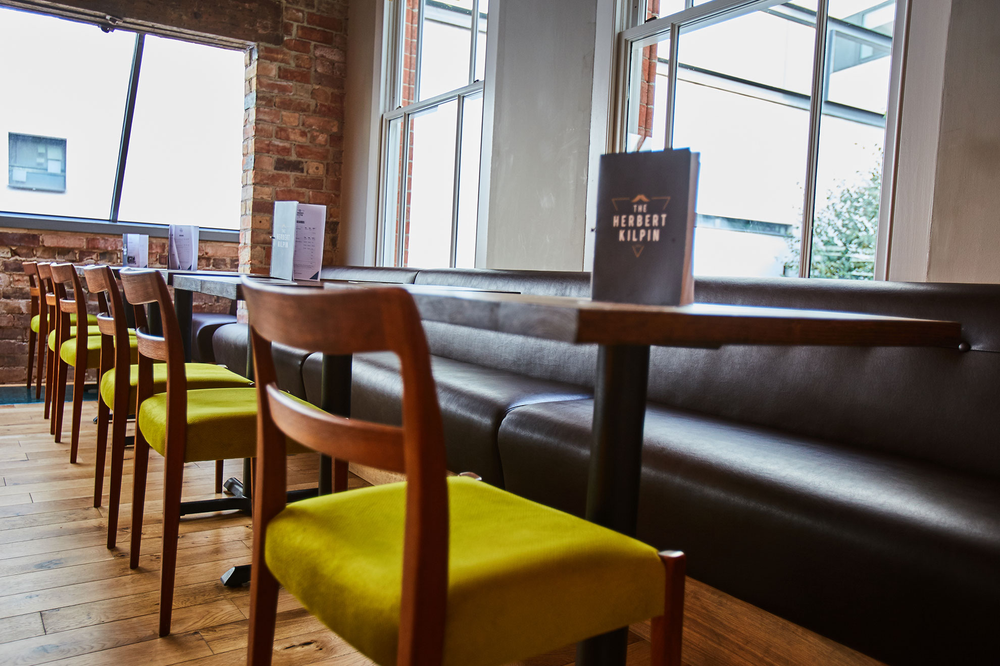
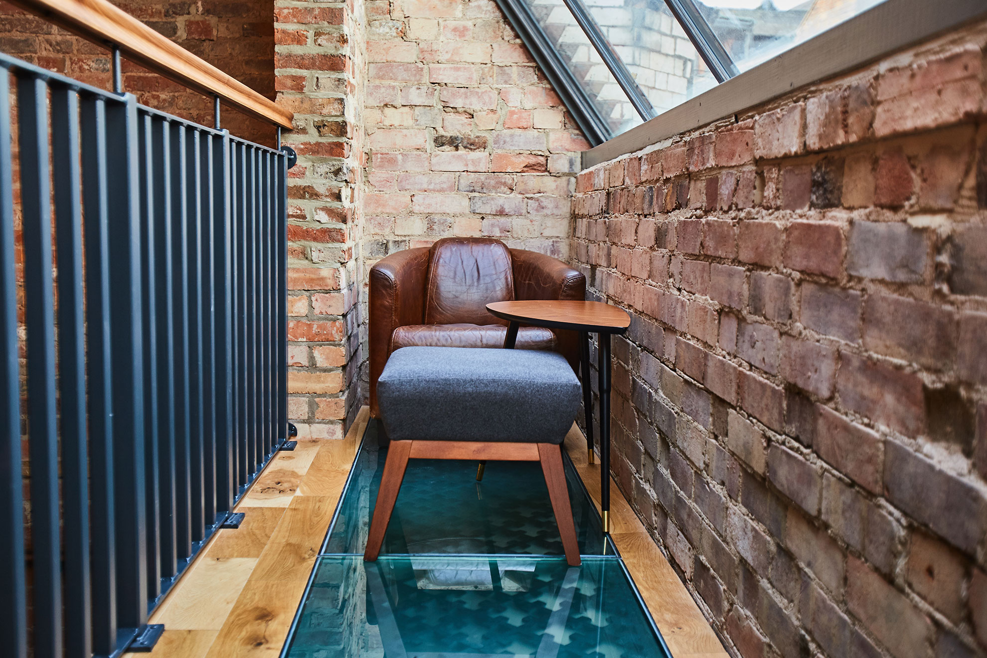
We used the building’s natural features of bare brick walls and large sash windows to maximise light and space. Parquet floor was added to the ground floor, which blended from dark to light wood as a way of showing people how to move around the space.
Ercol and traditional furniture were used throughout, along with different textures to create various zoning atmospheres.
The Fine Details
“Working with Julie Poulter Interior Design was a real pleasure from start to finish. She listened carefully to our outline brief and her input was invaluable in constructing a final mood board.
Her product knowledge and sourcing of items was hugely appreciated and vital in delivering the project on time and on budget.”
– Nigel Garlic (Herbert Kilpin)


